Java Tutorials and Guides

CSS Tutorials and Guides
CSS - Loading Spinner with a Semi-Transparent background
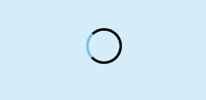
This tutorial demonstrates how you can build a Loading Spinner with a semi-transparent
background .
We will be using HTML, CSS and JavaScript to accomplish this task.
1. Add the following code to your HTML page
<!DOCTYPE html>
<html>
    <head>
        <link rel = "stylesheet" href="style.css"/>
    </head>
    <body>
        <button id="ExecButton" type="buton" onclick="showLoader()"> Execute</button>
        <div id="semiTransparenDiv"></div>
        <script>
        	function showLoader() {
                document.getElementById("semiTransparenDiv").style.display = "block";
            }
        </script>
    </body>
</html>
2. Add the following code to your CSS
body {
    background-color: #6CC4EE;
}

#ExecButton {
    margin-top: 800px;
    margin-left: 48%;
}

#semiTransparenDiv {
	width:100%;

	/*-Lets Center the Spinner-*/
    position:fixed;
    left:0;
    right:0;
    top:0;
    bottom:0;

    /*Centering my shade */
    margin-bottom: 40px;
    margin-top: 60px;

    background-color: rgba(255,255,255,0.7);
    z-index:9999;
    display: none;
}

@-webkit-keyframes spin {
	from {-webkit-transform:rotate(0deg);}
	to {-webkit-transform:rotate(360deg);}
}

@keyframes spin {
	from {transform:rotate(0deg);}
	to {transform:rotate(360deg);}
}

#semiTransparenDiv::after {
    content:'';
    display:block;
    position:absolute;
    left:48%;top:40%;
    width:80px;height:80px;
    border-style:solid;
    border: 5px solid black;
	border-top-color: #6CC4EE;
    border-width: 7px;
    border-radius:50%;
    -webkit-animation: spin .8s linear infinite;

    /* Lets make it go round */
    animation: spin .8s linear infinite;
}